Is reading the comic free?
Yes, completely, at least online!  If you’d like your very own print edition, it’s available for purchase in the store, and includes the first two chapters plus notes; 168 pages of story in an oversized 8.5×11 format with a slick, heavy cardstock cover! I’ll be offering an e-book version as well after the release of the second print volume.
How can I follow this comic?
An RSS feed is built into this website so you can have new pages sent directly to any aggregator. You can also follow my main website, Twitter account, the Facebook page, my Tumblr account, if you’d like to see announcements for each page along with other news from me. You can also become a follower on Patreon and have high-res versions of the page delivered to your inbox every week!
How can I support it?
This comic is posted free of advertising, and I don’t produce a ton of merchandise, either. If you’d like to shoot me some cash in between print volumes, you can visit my Patreon page and become a supporter! Monthly reader contributions through Patreon cover a very appreciated chunk of my monthly income. This allows me to avoid taking on freelance work that might disrupt my posting schedule. Folks who kick in $5 or more a month get access to pages in high resolution, notes on the previous week’s page, announcements, and more. Give it a try!
Who are you?
I’m a lady named Dylan Meconis. I never want to art school; I graduated with a plucky liberal arts degree in literature, history, and philosophy (with a side of French, which should explain the German errors early on in the web version of this story). I’m a full-time, self-employed cartoonist, writer, and illustrator.
I do most of my work at Periscope Studio, one of the largest collective studios of comics artists in North America, where I’ve been a member since 2007. It’s an honor to work with some of the industry’s most seasoned professionals. They know a lot of dirty jokes.
You can find out more about me at my primary website, or follow me on Twitter.
What is this?
Family Man is a graphic novel – which is fancy talk for “long comic book with pretensions” – and is historical fiction (with a twist or two). It’s published weekly on the internet, where I’m free from the constraints of traditional publishing or a regular print deadlines. This means I get to do whatever I darn well please, and if you like it, I’m more than a little happy.
This comic is for mature readers, so if you know yourself to be queasy or impressionable about the usual Bad Things, best look away.
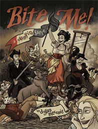
Is this a prequel to your other comic, Bite Me?
No, not really. You’ll recognize a character or two, but the events of Family Man won’t particularly anticipate or reference the events of Bite Me, and even the crossover characters are different in some rather important ways.
It’s meant to stand completely on its own, and present a considerably less cartoony world. Any rules or facts established in one work do not in any way apply to the other. I apparently enjoy confusing and alienating my readers.
Bite Me is available in a handsome print edition and is also available for free reading online! Go on, it’s silly.
What’s with the crazy noses? Do they have a point? (No pun intended…)
When I originally designed Luther for “Bite Me!”, prior to Family Man, it was in a much cartoony art style which allowed for some extravagances. Since he was a sarcastic werewolf in that story, the nose was a fun way to reference both his ability to sniff out B.S., and to suddenly grow a snout. Also I just liked drawing it.
Obviously Family Man has a much more realistic art style, and the Luther depicted here is quite a different person, so why keep such a weird design element? Rest assured that there IS a reason – and that if it irritates or distracts you, it’s doing its job (and if it gradually stops irritating or distracting you, even better).  The design is based on the noses of Zanni (a commedia dell’arte character archetype) and Cyrano de Bergerac.
Werewolves? What?
Again, wait on it. God, I’m awful, aren’t I?
Is Ariana actually taller than Luther, or is she just wearing heels?
She’s a few inches taller than he is. And they’re both wearing heels.
What are you using to create these pages?
 I’ve produced pages of this comic in different ways over the years.
Currently, I create a panel layout for the page in MangaStudio 5. I do all the initial drawing in that program as well. I drop in digital lettering guides in Photoshop and turn everything a very light blue. Then I print it out on nice heavy Bristol paper (at print size; unlike many comics people, for this project I don’t draw much bigger than you see in the print edition).
I ink and letter over the blue printout, using a combination of cheapo India Ink Faber-Castell PITT Artist pens for lettering and boring lines, Micron tech .01 pens for fine details, and a rotating cast of Kuretake and Zebra brand pens for all the lines that require a little romance.
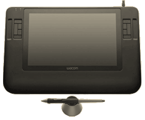
I scan everything at 600 dpi and, using Photoshop, drop out the blue lines peeking out from behind the inks. I drag everything back into MangaStudio 5. Then I haul out my most useful weapon – a Wacom Cintiq. This is a footwide, pressure-sensitive digital stylus pad and pen, which allows me to draw and “paint”  directly onto a digital display. I tidy up and make any corrections (messy lettering) or replacements (a poorly drawn face) to the linework.
Sometimes, if the page has lots of complicated things I’m using reference for (like, say, architecture), I’ll skip all that real-world stuff above and make those lines digitally.
Then I create all the shading and texture in MangaStudio and Photoshop. That part is generally quite time intensive and technical, but in the end it hopefully lends a depth and atmosphere to the pages that would be lacking otherwise. All you need to know is that I listen to a lot of weird TV while doing it so my brain doesn’t go crazy from neglect.
Like all comic book artists, my technique is horribly flawed and backwards and nobody should try to replicate it.
What about all the lettering and character handwriting?
Most of the dialogue (in word balloons) is hand-lettered by me, on the original paper, as part of the art. If I need to correct dialogue after I’ve scanned in the physical page, I’ll replace the original with a font created from my handwriting by Jenn Manley Lee.
For instances where characters have written something, I have a small library of professionally created typefaces.
Luther’s handwriting is LaDanse, designed by Gábor Kóthay. Ariana’s handwriting is P22 Declaration Script (several designers). Other incidental typefaces I’ve used include Aunt Mildred, Porcelain, and a bunch of obscure blackletter/fraktur typefaces provided to me by historical typography nerds lurking around the corners of the internet. Thanks, type nerds!
What else have you done?
Tons of stuff, too much to list here! You can visit my main website to see my portfolio and find all of my other projects: DYLANMECONIS.COM
What kind of research have you done for this?
A fair amount. I refer you to the Library on this website, which has a good starting bibliography (minus some things that might be spoilers). You can also see what kinds of nonsense I dig up in the Notes page. For more answers to still more questions, you can also refer to episodes of the podcast, where I answer reader questions to the best of my abilities.